
Ticket Avengers Mobile App Design
Client
Driven (formerly Ticket Avengers)
Timeline
October - November 2022
Focus
Service, Experience and Interface Design
Design Team
Caroline Bosch, Amanda Alvarado, Robert Burnette, Jarvis Witte and Sarah Hunt
Ticket Avengers is a Detroit-based fintech startup that offers a buy now, pay later (BNPL) service for municipal fines like parking tickets and moving violations.
Our team of five General Assembly UX Design Immersive students collaborated with Ticket Avengers over three weeks to design a new mobile app aimed at simplifying loan applications and payments.
Through user and market research, evaluation of both front and backend services, and prototype testing with 17 users, we refined our solution before delivering it to the client.

The User Need
Low-income motorists need a reliable way to pay municipal fines promptly to avoid late fees and legal issues
The Business Need
Ticket Avengers needs to automate their loan approval process, improve client communication networks, and facilitate loan repayments
Service Design
Synthesizing four distinct, hands-on phases
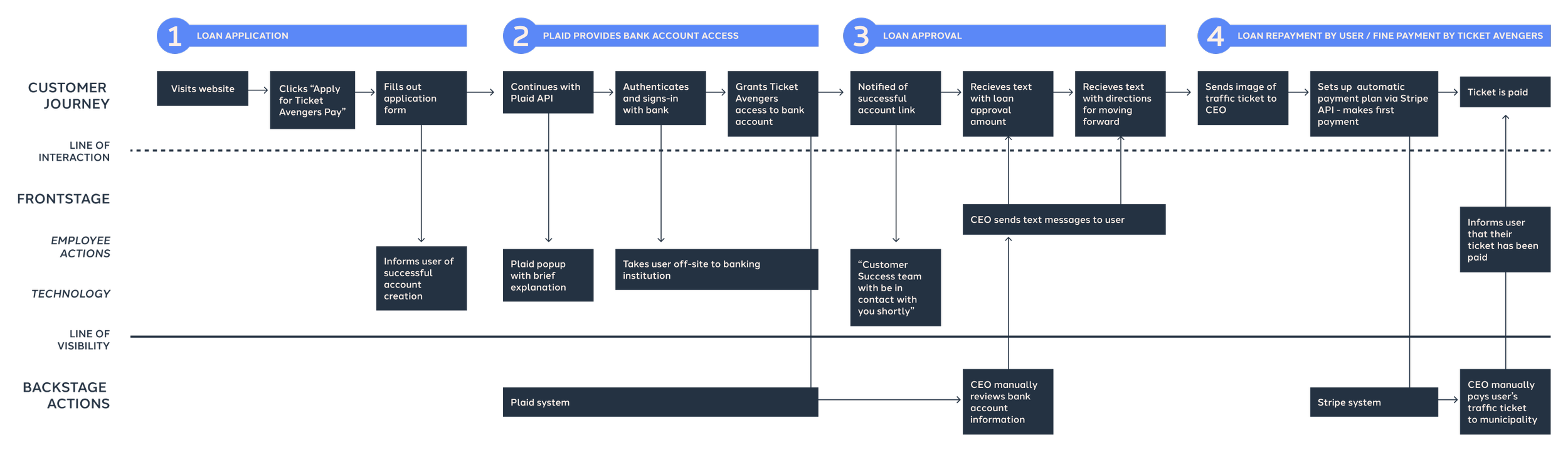
Before diving into research and design, we needed to understand Ticket Avengers' operations. We created a service blueprint to visualize the whole process, from customer interactions to backend tasks. This process helped us see an opportunity to streamline four distinct phases into a seamless flow.

User and Market Research
“I feel more comfortable when I’m guided through an application process.”
To gain deeper insights into our users and supplement the information provided about BNPL loans, we conducted six user interviews, gathered data from secondary sources, and analyzed competitors and comparators.
From our research synthesis, three key insights emerged, guiding us to identify key opportunity areas to drive our design forward.
Insight One
Trust
Users tend to trust platforms that feel familiar, either through prior experience with a product or through recognizable interface design.
How can we leverage a clean, simple UI and a familiar visual style to cultivate trust among users?
Insight Two
Guidance
Users want to be guided throughout financial transactions through notifications and ease of access to important information.
How can we ensure users feel guided throughout financial transactions?
Insight One
Emotion
Money is an emotional topic for most people. Users of this service are likely to be in a difficult financial situation, and are already experiencing stress.
How might we embody a reassuring tone so users feel empowered and confident across all touchpoints?
Defining Structure and Flow
Everything revolves around a central payment dashboard
With our key opportunities in hand, we began brainstorming potential solutions in a design studio session in which each team member - along with the Ticket Avengers CEO - sketched and then pitched their ideas to the rest of the group.
We then converged our ideas into a user flow diagram to guide the design of our higher fidelity screens.
The solution we landed upon revolved around one central user dashboard, which would serve as an informative, easily accessible anchor point from which users could view their current and past loans, start a new application, or set up payments. This dashboard was our solution to converge the previously disjointed phases - plus, we knew this structure would allow for changes to global navigation as the service expanded.

Designing and Iterating
Editing copy for improved clarity, keeping important information in reach, and emphasizing security and trust
After sketching and iterating on low-fidelity wireframes, we conducted our first round of usability testing, made changes according to feedback, and brought our solution to high-fidelity.
Here, you can see the main view of the dashboard before a user sets up their loan payments. To maximize screen space on the dashboard, I designed collapsible sections representing each loan. These sections could easily be shifted down if Ticket Avengers decided to add more data to the dashboard in the future.
We also made sure to include hyperlinks with information relevant to each section, to answer anticipated questions before users had to go searching for that information on their own.

Weaving trust and guidance into every stage of the journey
In our final prototype, we focused on content strategy; specifically messaging, tone, and placement of helpful links that provide clarity on terms and conditions.
In the dashboard empty state (left), we included a secondary “learn more” button linked to a page explaining each step of the application process. In the dashboard pre-payment state, there’s a tooltip explaining available credit terms, and a hyperlink to details on the payment plan. Once users are paying back their loan (right), they can easily access past payments for their records.

Full transparency - even before account creation
In our initial evaluation of Ticket Avengers’ original loan application flow, we found that a lack of context was a major barrier to conversion. To eliminate that barrier, we designed a menu explaining exactly how the service works for the user.

Usability Testing
Keeping global navigation visible at all times, so users know exactly where they are - and where they can go from there
We conducted remote, unmoderated usability tests with 17 users at both mid and high fidelity. For our high fidelity test, we had very positive results, with a 100% task completion rate for 3/4 tasks, and a 94% completion rate for the fourth task.
The fourth task - to find the profile page in three clicks or less - proved to be the least intuitive for users. This insight made me realize that we needed to devote more time to information architecture.
Since we were on a tight timeline, I decided to conduct additional research on mobile app navigation by reading articles and looking at competitor products. I made the decision to implement a more intuitive tab bar, which would help users navigate the app and allow for future scalability.
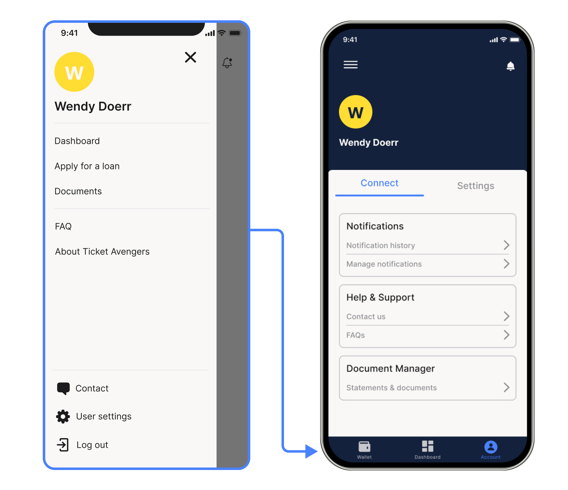
Hamburger menu pre-testing (left), and profile page with tab bar (right). This tab bar includes the wallet, which is a page that would be implemented in a future iteration.
Some final thoughts…
Following a strict design process can (sometimes) limit creativity
Due to the three week timeline of this project, we made the decision to move from each ‘stage’ to the next without revisiting initial stages later.
Looking back, I believe our solution could have been stronger if we took a more iterative approach, but we were certainly more efficient by sticking to our schedule.
On startups and lifelong learning
Since Ticket Avengers was still in its early stages during this design sprint, not everything was set in stone. We had to make a lot of assumptions about copy, and leave out some visual elements that may have made the experience more enjoyable and clear for users.
Overall, though, I appreciate working with smaller businesses because it allows me to dive even deeper into the industry (in this case - installment loans and fintech) to fill in the blanks.