
The Tight Fit Admin Portal Redesign
Client
The Tight Fit
Timeline
August - November 2023
Focus
Experience and Interface Design
Design Team
Caroline Bosch & Adrienne Kaplowitz
The Tight Fit is a fitness scheduling software that allows individuals to suggest and book on-demand fitness classes at a range of participating studios. Our project focused on auditing and redesigning the business-facing admin portal. We aimed to enhance user onboarding, improve navigation, and integrate new features for studio administrators.
I also designed, built, and illustrated The Tight Fit’s website.
The Final Prototype

Project Overview
The Tight Fit’s original admin portal was disorganized and confusing for users due to inconsistent labeling and a lack of clear structure. To tackle this issue, my colleague and I conducted a comprehensive UX audit of the whole product to understand its usability and information architecture.
We then conducted usability testing sessions to pinpoint user pain points and challenges. Our findings were compiled into a detailed report, categorizing issues into technical, structural, and informational categories. Based on these insights, we developed a series of proposed solutions aimed at improving navigation, streamlining user interactions, and enhancing overall user experience.
Challenge One
Onboarding tasks must be completed sequentially, but users don’t know the correct sequence
Studio admins using The Tight Fit for the first time land right on an empty calendar. They know the goal is to list vacancies in their class schedule, so they click and drag on the calendar to start adding availability. They are immediately met with the following error message: “Please create a room before adding a time slot.”
They then begin clicking through the seven (7) tabs on the screen in front of them, trying to figure out what to do first.
Solution One
Integrate a series of simple questions into the initial account creation flow
In order to help guide studio administrators through a more straightforward account creation flow, we integrated a series of simple questions with a progress indicator and an easy way to save and continue later. This streamlined the process and provided clarity to users, who no longer needed to guess their way through onboarding tasks.
Onboarding Step 1: Tell us about your business
How it worked before

The initial screen users encountered upon logging in was nearly empty, with the main action button ('Create New Studio') tucked away in a corner. During testing, 40% of users navigated between tabs ('Studios' and 'Users') before locating the button. Test participants expressed confusion about the labels 'Users,' 'Studios,' and 'Create New Studio,' indicating a need for improved microcopy, labeling, and context throughout the portal.
How it works now

Users no longer encounter that initial screen, and are instead prompted to fill out all necessary contact, location, and admin access details associated with their business account during step 1 of the onboarding flow.
Onboarding Step 2: Configure your studio settings
Before: “What now?”

In order to book fitness classes through the app, studio admins need to provide The Tight Fit with details about each location, including class types, available rooms, and instructors with their corresponding class types.
The original portal didn’t lead first time users through this process. One participant in our usability test expressed, “I had no idea what to do after I filled out the form to create a new studio. I felt completely lost.”
After: Clear task sequence with helpful microcopy

Challenge Two
The navigation structure needed to be redesigned
Integrating the new onboarding flow meant that we had to reimagine global and local navigation to eliminate the original tab structure. While doing so, we wanted to ensure that the entire experience was as simple as possible for users. The core functionality of this software is simple, and the interface and experience should reflect that.
Solution Two
Keep the sidebar menu, remove the tab bar, and design a more straightforward structure while fine tuning the overall user experience
Original Sitemap

New Sitemap

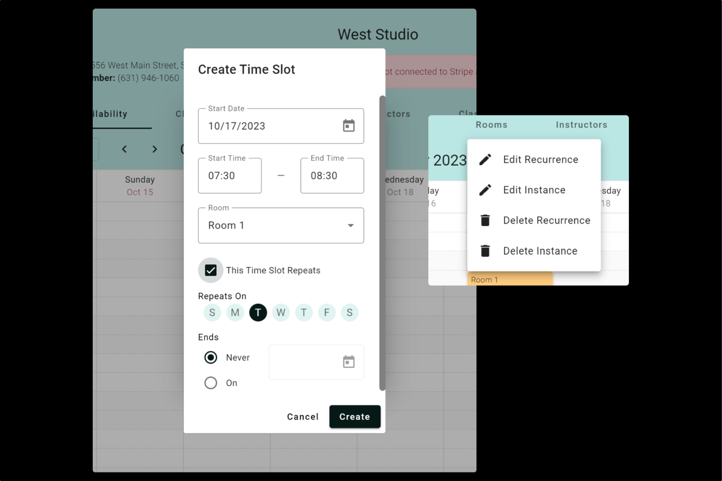
Availability
Easily add single or repeating gaps in a studio’s schedule
The client didn’t want a complete overhaul of the system, and we had a solid base to build off of for the availability functionality. We kept the interface almost the same as the original design, with a few key updates:
We updated the UI, and made the CTA button more obvious to users.
We made sure to inform developers to build the calendar in a way that allows users to click and drag to create a timeslot, so they don’t have to rely on the “add availability” button (this was something every participant tried to do in testing)
We updated the format of the add availability field to have more specific microcopy and more flexibility in listing repeating timeslots
Adding Availability - Before
Adding Availability - After

Classes
Manage current, pending, and past classes in one place
Our revamp of the class scheduling page consolidated classes of all statuses into a single viewer, offering filter/sort, export, and search functionalities.
For current classes, we integrated a class check-in feature, and for all classes, we provided visibility into participant lists.


Final thoughts
Despite budget and time constraints, the redesign significantly improved usability, raising the SUS score of the portal by 15 points. The streamlined onboarding process and enhanced features led to increased user satisfaction and efficiency for studio administrators.
This project taught me that - even with limited resources - substantial improvements can be made to usability and user experience. It's essential to prioritize key pain points and focus on solutions that deliver maximum impact within constraints.