Admin Onboarding for TightFit
Streamlining onboarding and improving class management in TightFit's studio admin portal.
Web
2024
Streamlining onboarding and improving class management in TightFit's studio admin portal.
About this project
TightFit launched an MVP of their studio admin portal with core functionality in place, but the product had grown without a strong foundation. Navigation was unintuitive, language was inconsistent, and new studio owners had no guidance getting started. It was time to bring order to the system.
Working as a design team of two, we conducted moderated usability testing and a heuristic evaluation to identify the biggest friction points across the product. Two clear challenges emerged: a confusing onboarding experience and a poorly structured information architecture.
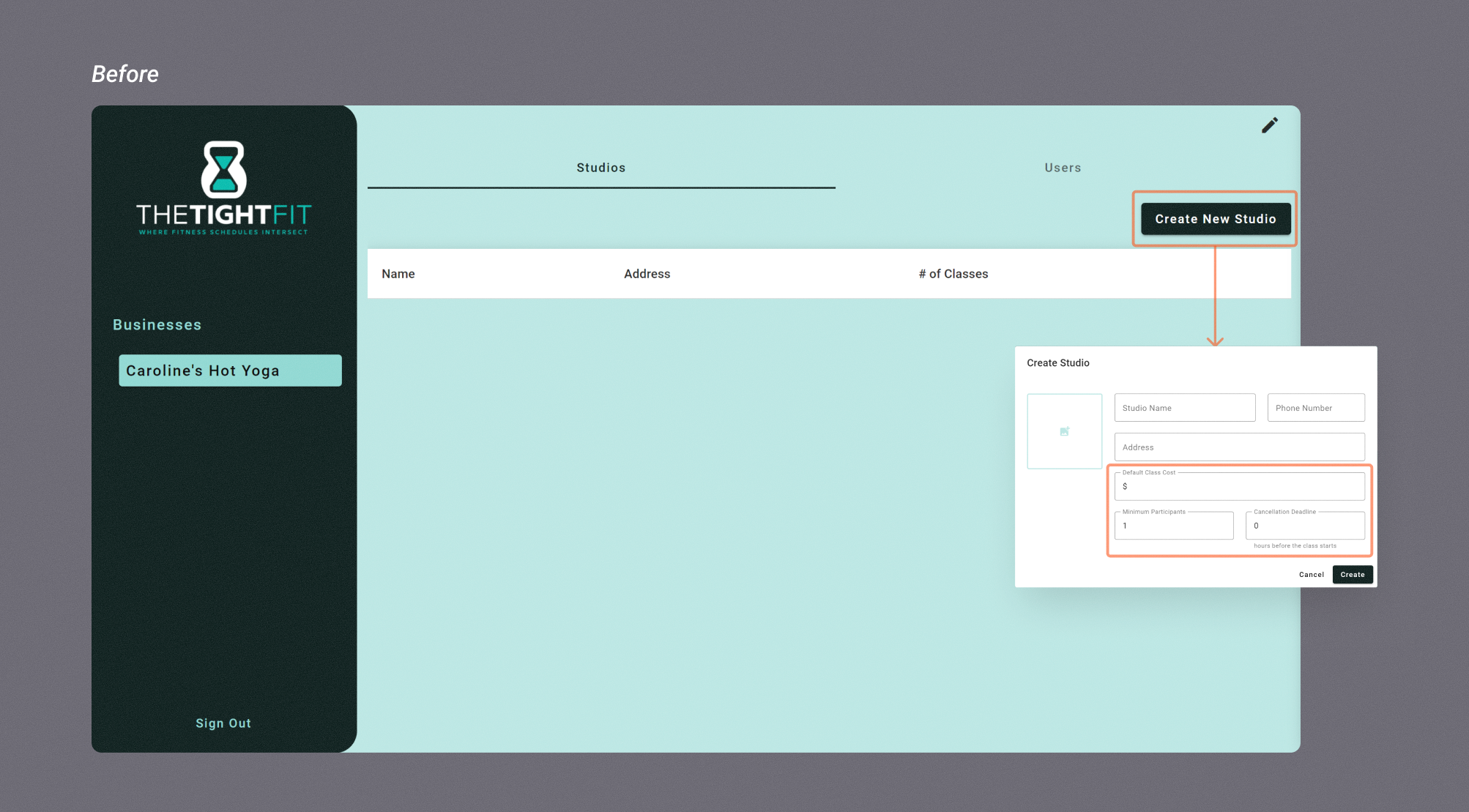
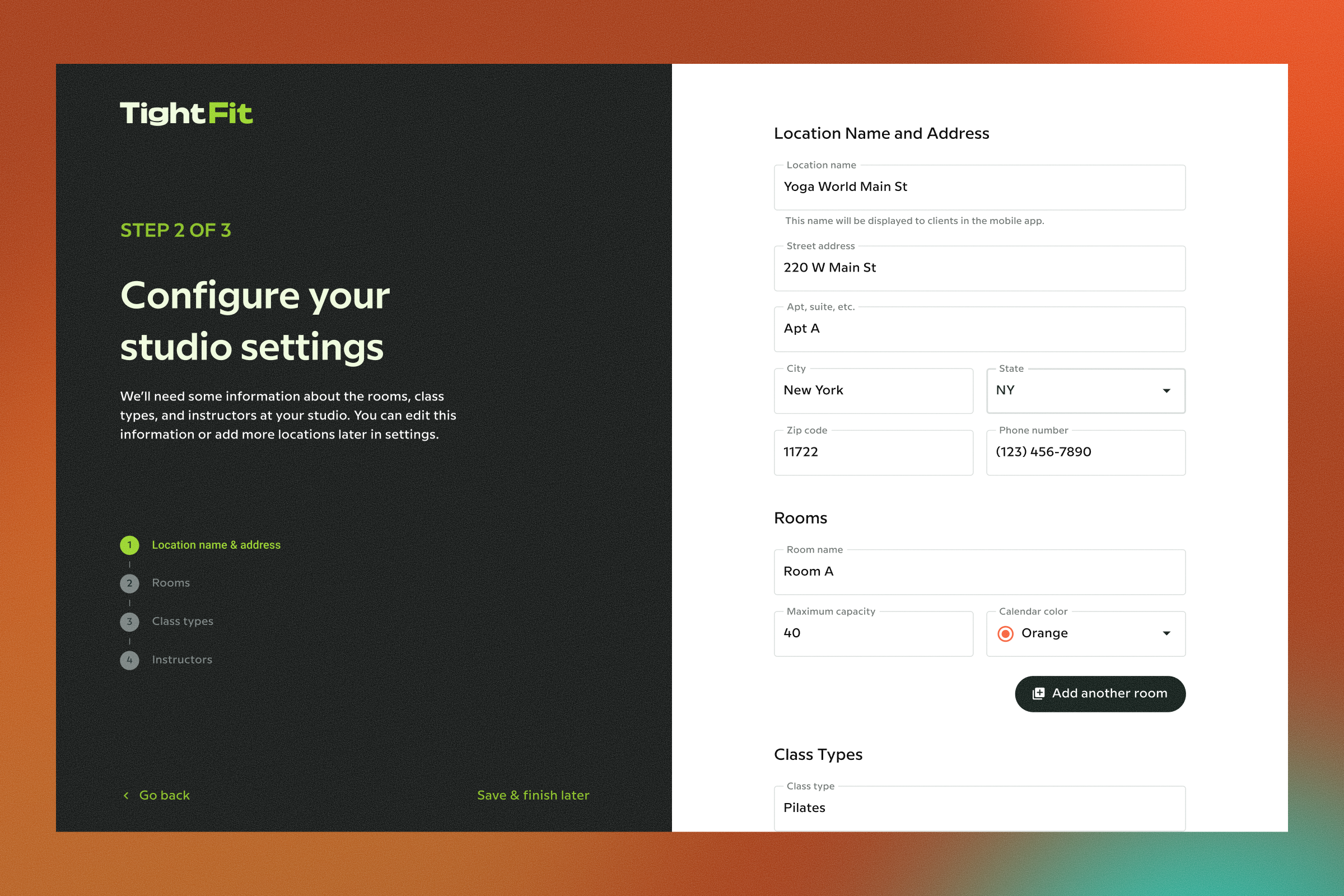
Challenge 1: Onboarding Step 1: Create New Studio
The screen that users encountered upon initial login was nearly empty, with the main action button tucked away in a corner. During testing, 40% of users navigated between the tabs 'Studios' and 'Users' before locating the button.
Test participants expressed confusion about the labels 'Studios,' 'Users,' and 'Create New Studio.' No context was given for important global settings like default class cost, minimum participants, and cancellation deadline.
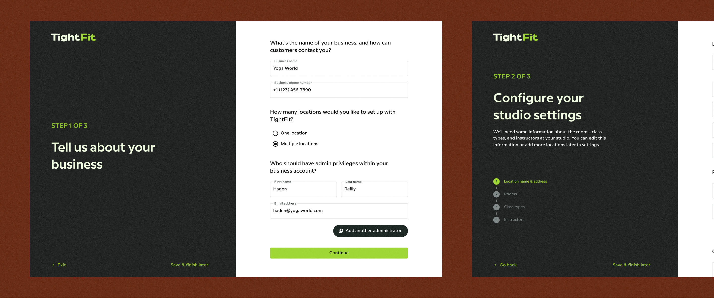
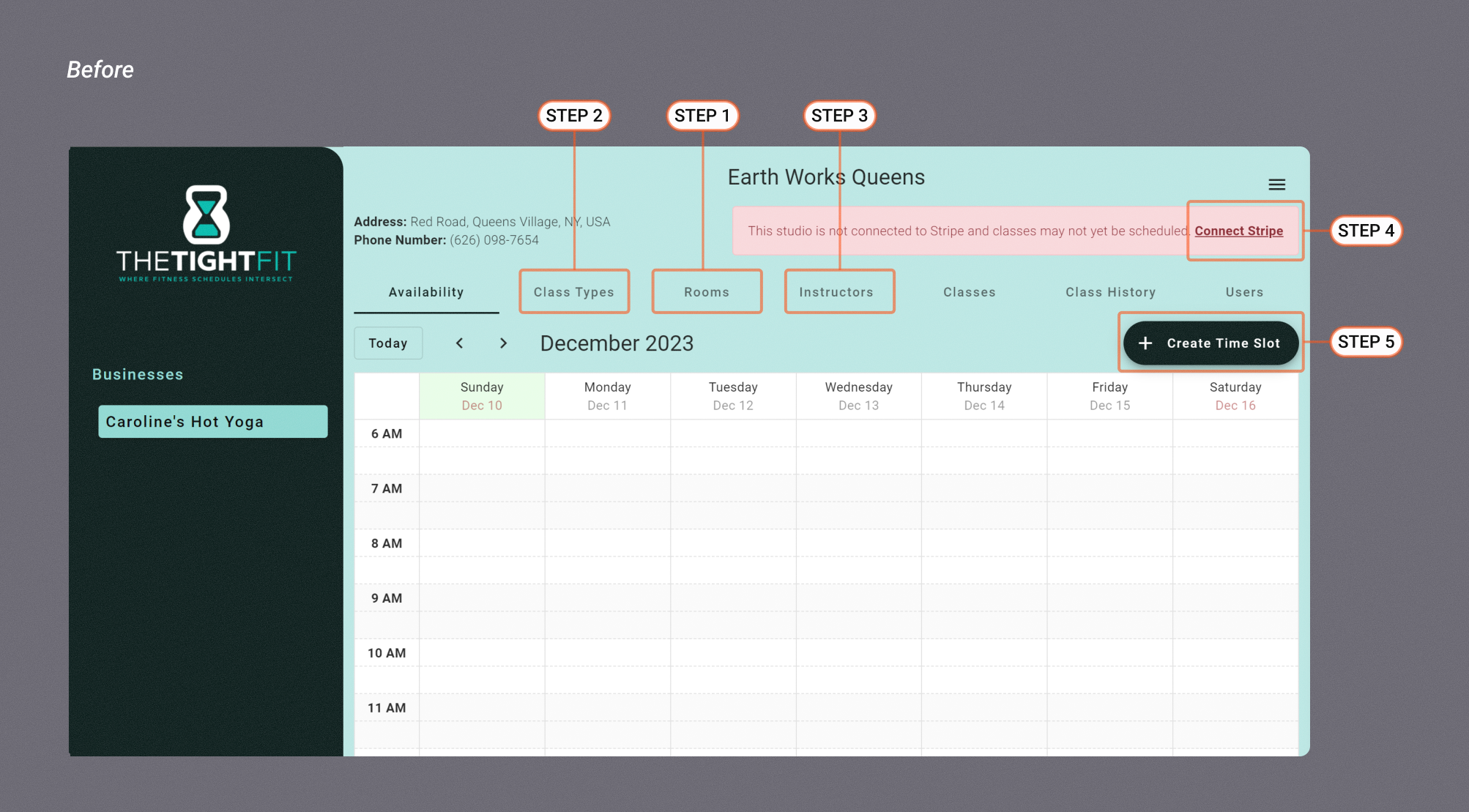
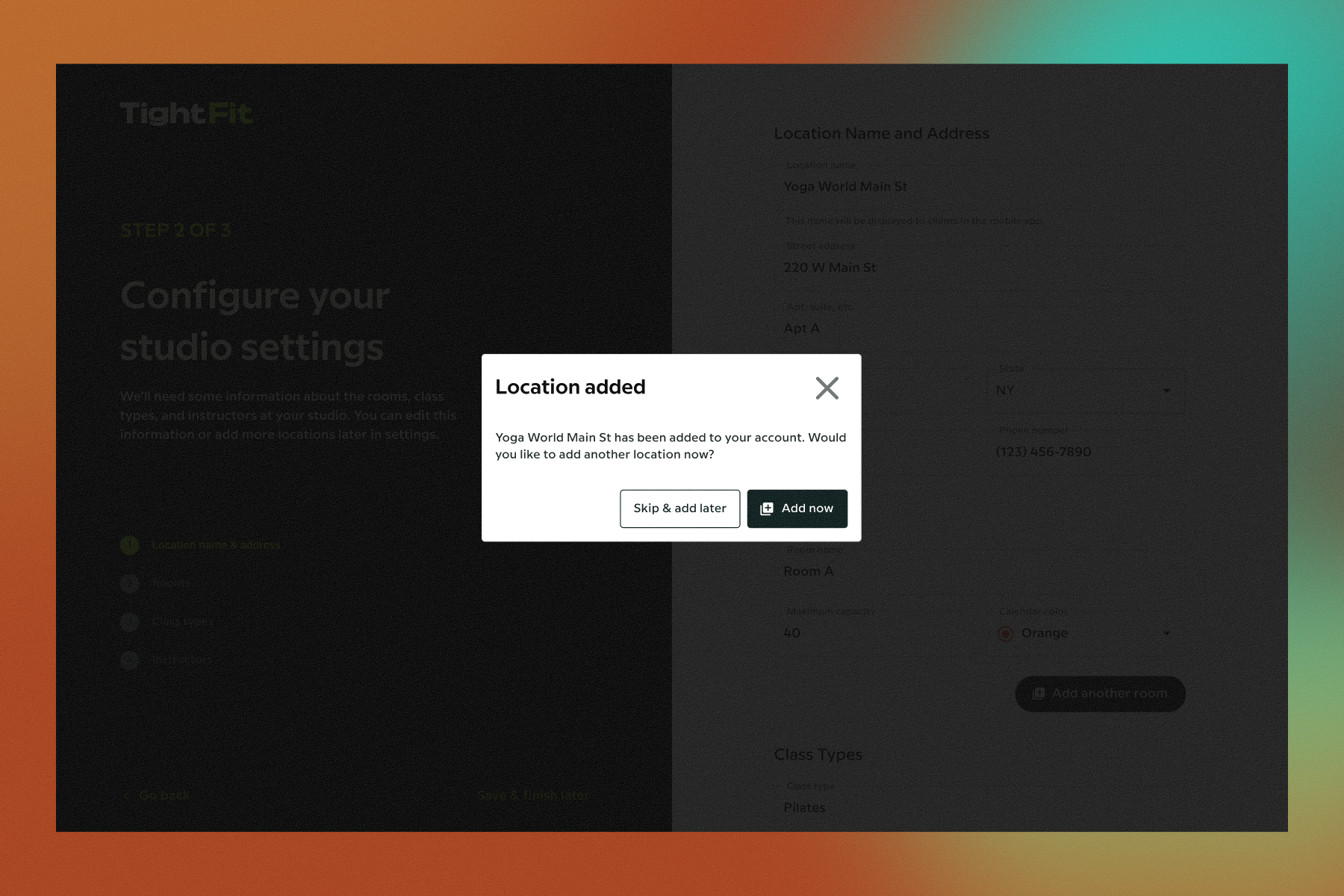
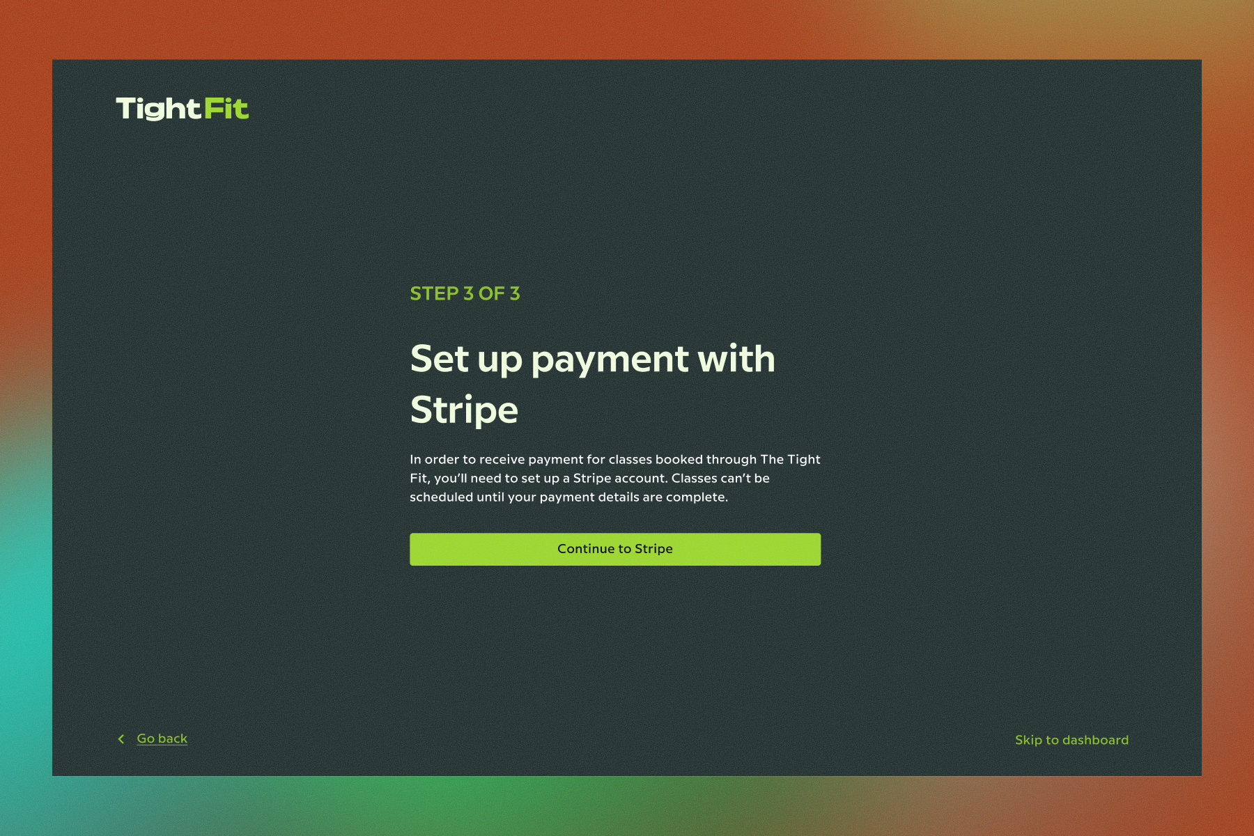
Challenge 1: Onboarding Steps 2-6: Add class types, add rooms, add instructors & connect to Stripe
After the 'Create New Studio' step, users landed on an empty calendar with seven tabs spanning the length of the screen. They knew the goal was to list vacancies in their class schedules, so 80% tried to start adding availability into the calendar as their first step.
They were met with this message: “Please create a room before adding a time slot”
That uncovered step one, which most users did correctly guess needed to be completed under the 'Rooms' tab. As for the rest of the steps... it was a (less lucky) guessing game.
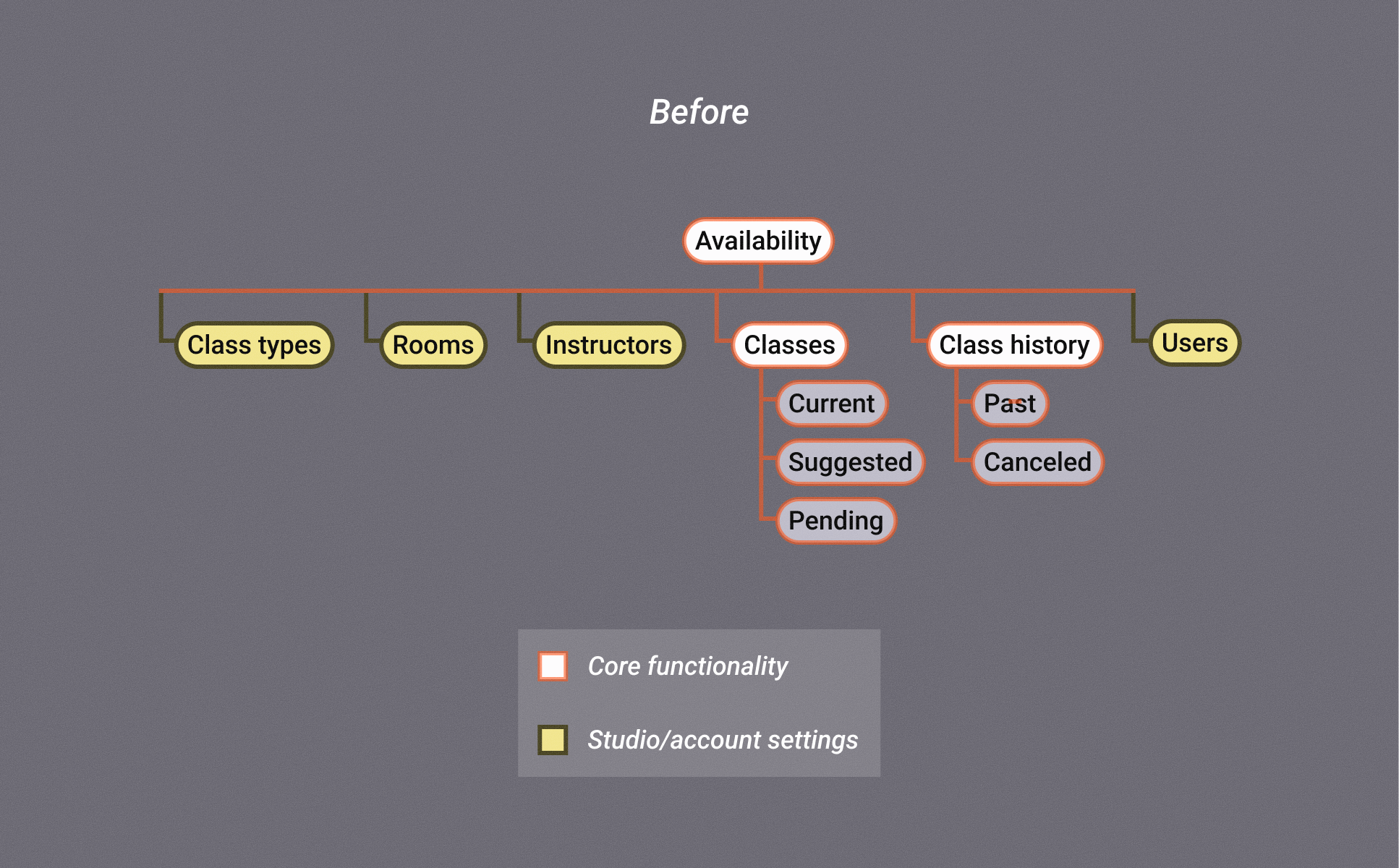
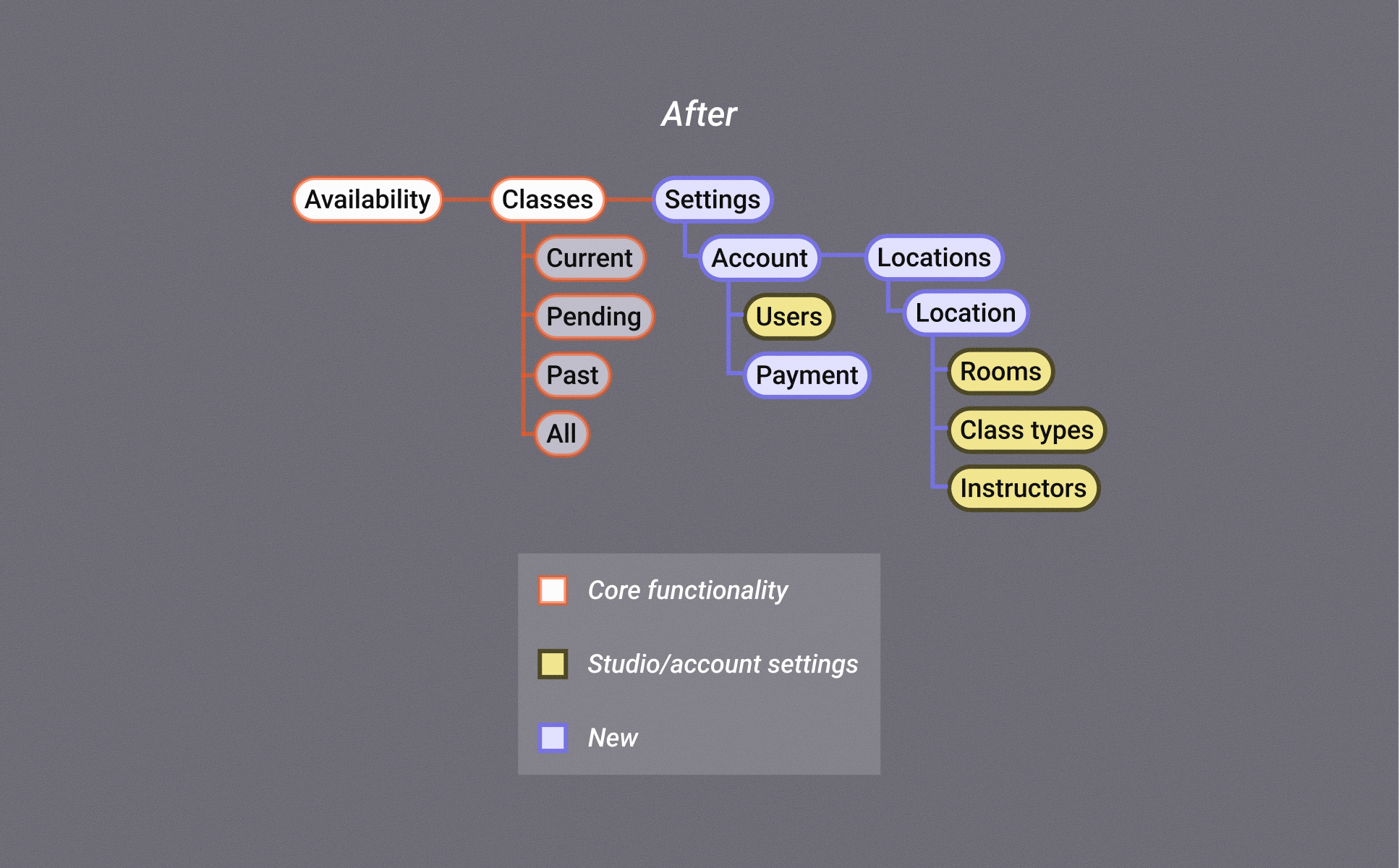
Challenge 2: Site structure
Integrating the new onboarding flow meant we had to reimagine global and local navigation to eliminate the original tab structure
Overall, an improvement in user satisfaction was
indicated by an increased task success rate & SUS score along with positive qualitative feedback
We conducted moderated usability testing of the completed prototype with 5 users. The results gave the founder confidence to move forward with the proposed redesign.
40%
15 pt
100%